As an Environmental Visual Communications student, I had an assignment to do a mock rebranding of an environmental organization. The goal was to research the organization to get an idea of their values, mission and identity, and then use that to design a logo, letterhead, and business card. I chose a small, local organization called Greenest City, whose mission is essentially to provide people living in the city with the access to affordable and sustainable food sources, while also strengthening community bonds. I decided that a good logo for them would focus on gardening/sustainable food growth, accented by a sense of community, teamwork, and/or togetherness, as well as the inclusion of elements representative of the urban setting.
The first step after settling on an organization, was to get those creative juices flowing with some sketching. I wanted to include some of those sketches here, but apparently I didn't make those sketches in my normal sketchbook, and can't seem to find the sheet of paper, so I guess until I find it, you'll just have to believe me when I say I did them...
Anyway, from those sketches, I picked a couple of ideas that I thought were promising and started mocking them up on my computer. Some examples of which can be seen below.
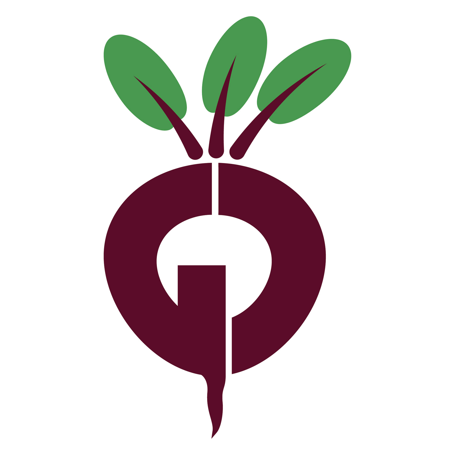
First version of the "Beet" logo
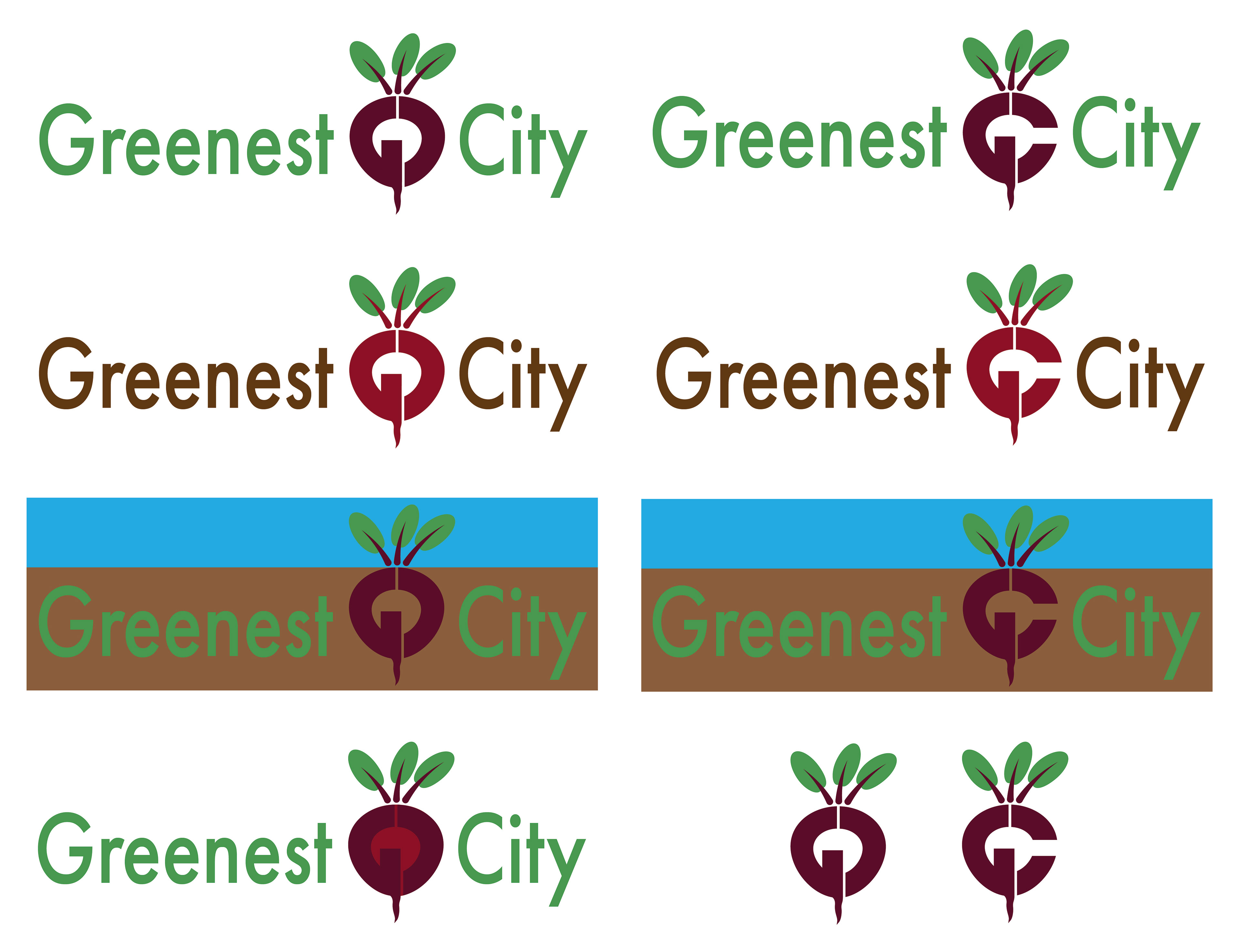
Variations of the "Beet" logo with wordmark
This first option I decided to try was the root vegetable (I designed it as a beet, but if you want to interpret it as a radish instead, I won't be offended) which was made up of the organization's initials (GC). I played around with letter orientation, colours, and including the organization's full name.

For the second design I wanted to incorporate all three elements that I thought represented the company (gardening, community, and urban setting). However, this proved to be very difficult without making it way too busy, so I removed the city element I had initially included (a building filling in the empty space between the two people) and focused more on the community aspect, which I felt was their main value.
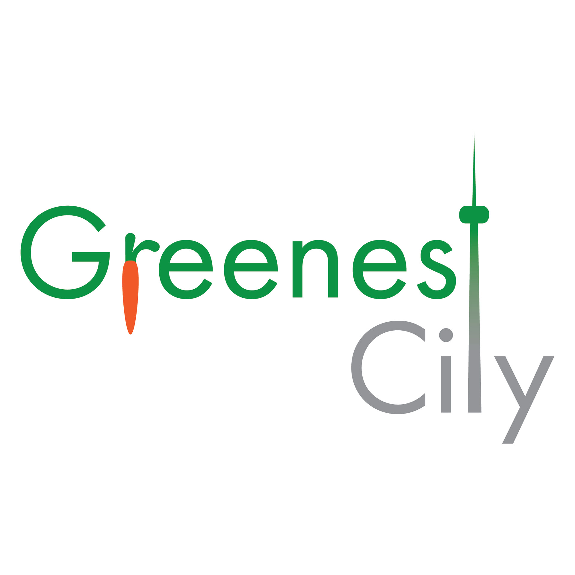
And lastly, for this third design, I went with a word-mark, using the CN tower as the "t" in both words which also served as a literal connection between the garden and the urban environment. I added in the carrot as the "r" in "Greenest" to represent the organization's central theme of gardening/sustainable food.

In the end, I decided that my strongest logo design was one of the "GC Beet" logos, and that sentiment was echoed by my instructors and classmates, so I decided to continue forward with that one. Taking into account some feedback that I received in class I made some changes to the leaf stems, making them more sharply angled than rounded (to better match the style of the letters), which lead to an epiphany on the subway that I could incorporate some subtle city/urban flavour to it by shaping the middle leaf stem like the CN Tower, resulting in this final logo design.
With the logo settled on, it was time to move on to working on developing some designs for letterhead and business cards.
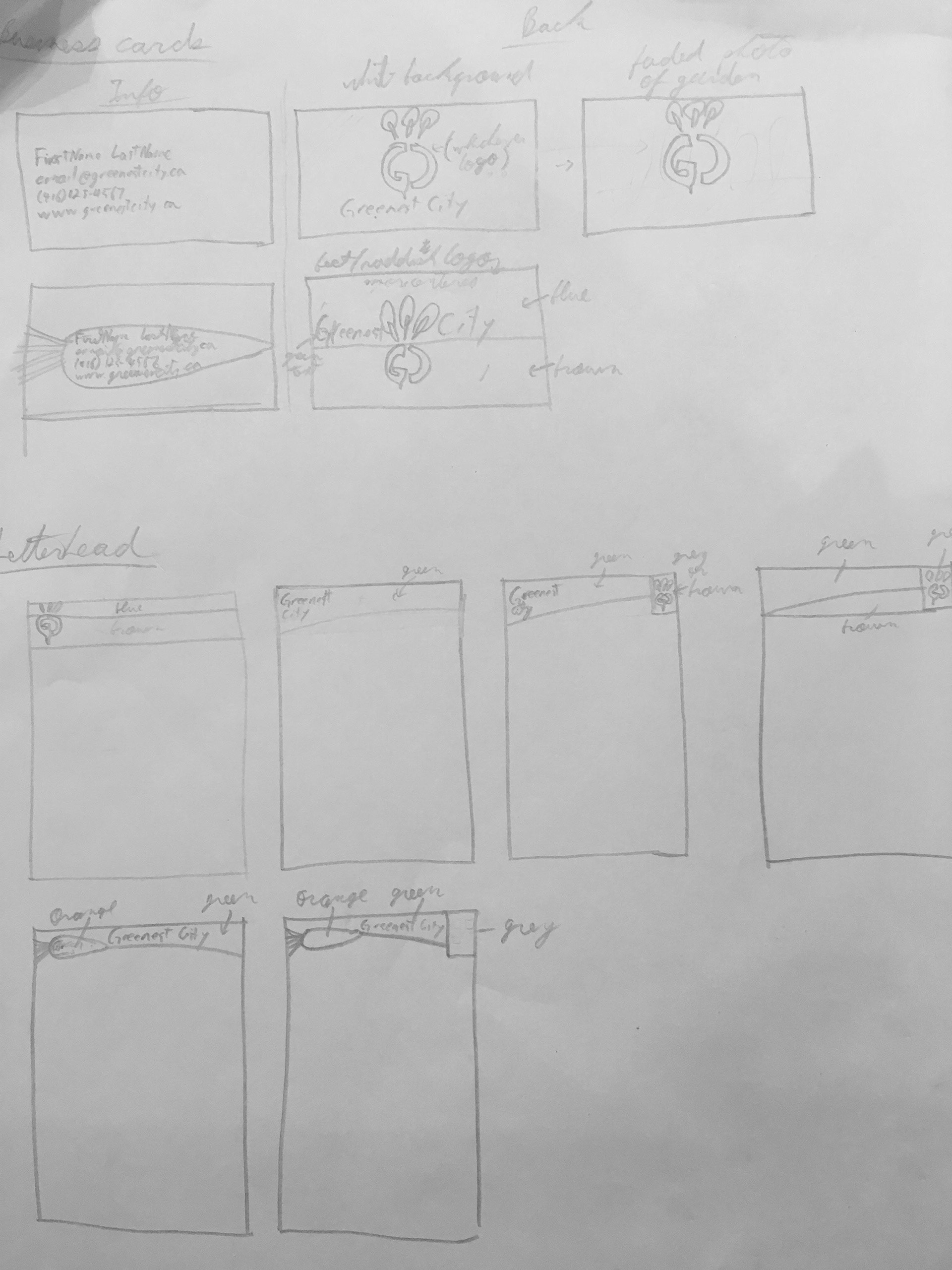
As with the logo, step one was sketching out ideas, and this time I managed to find them! I had to digitally erase the comments from my instructor, but the sketches are all there.
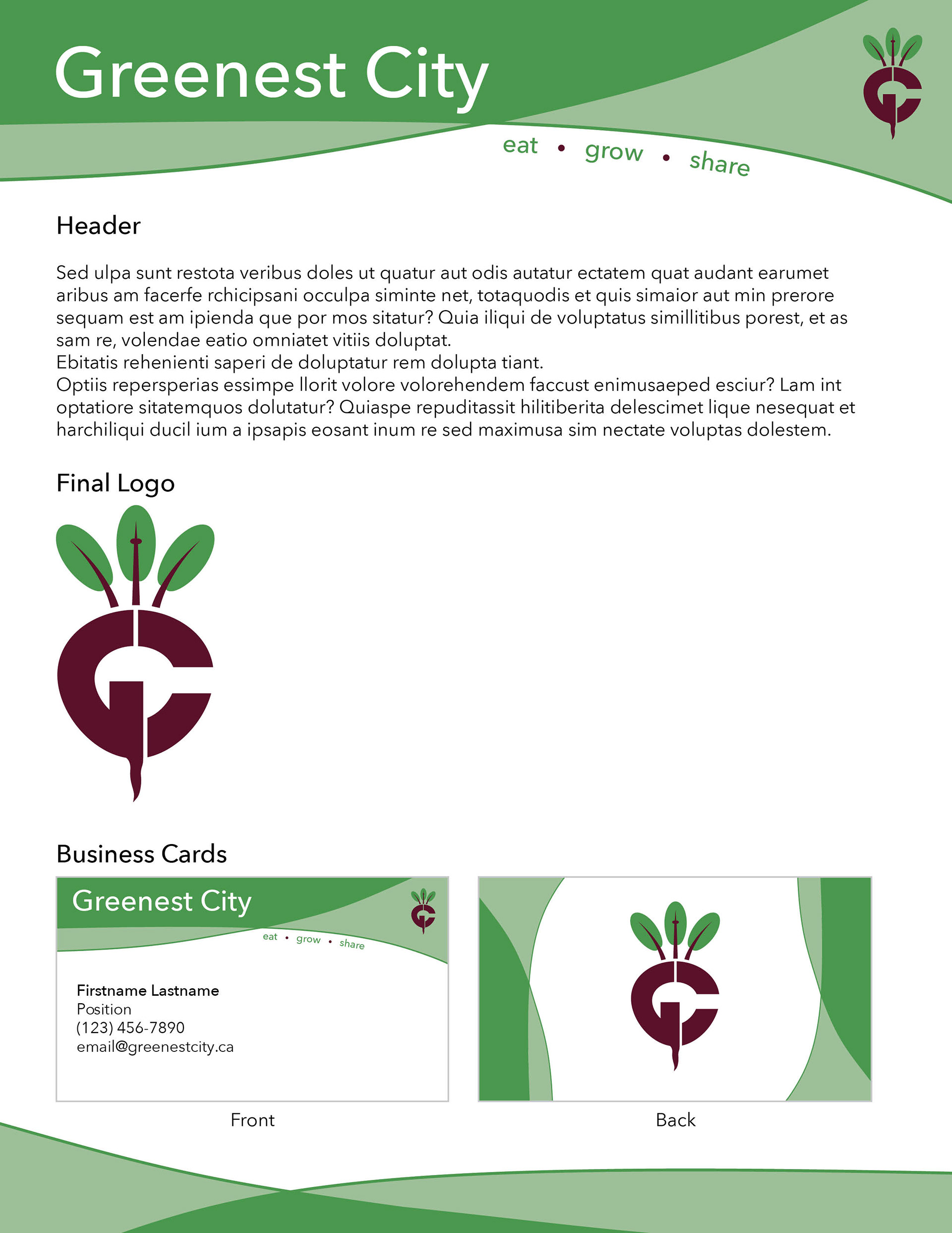
As I find is often the case when I start working on a design on the computer, I ended up significantly reworking my letterhead design , and by the time I settled on a final product, it looked very little like any of the ideas I sketched out on paper. I also decided to include the "eat, grow, share" slogan that is a part of their current branding. I then repeated the top/bottom elements of the letter head into the business card to give everything a cohesive, consistent feel.
As a bonus, I made this short animation of my Greenest City mock rebrand logo for an assignment in my Multimedia Methods class, I designed it with the idea that it could function as an intro/outro to help give their videos a consistent style.