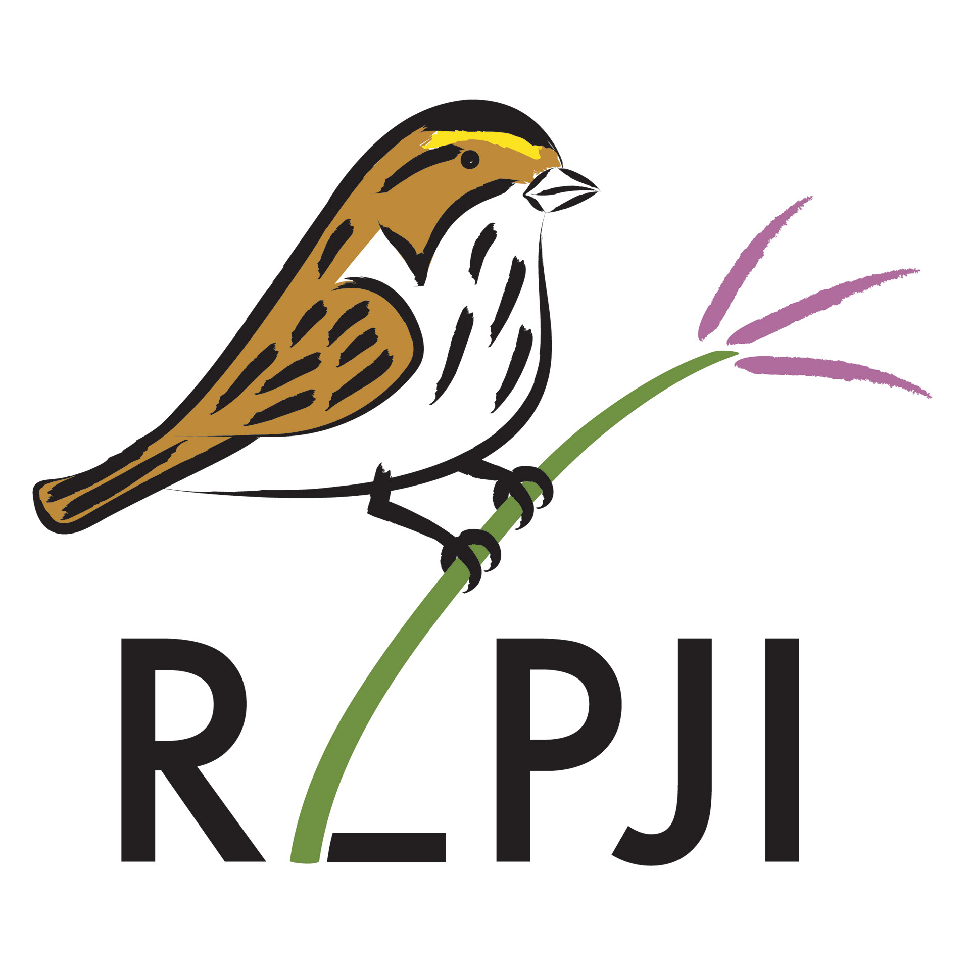
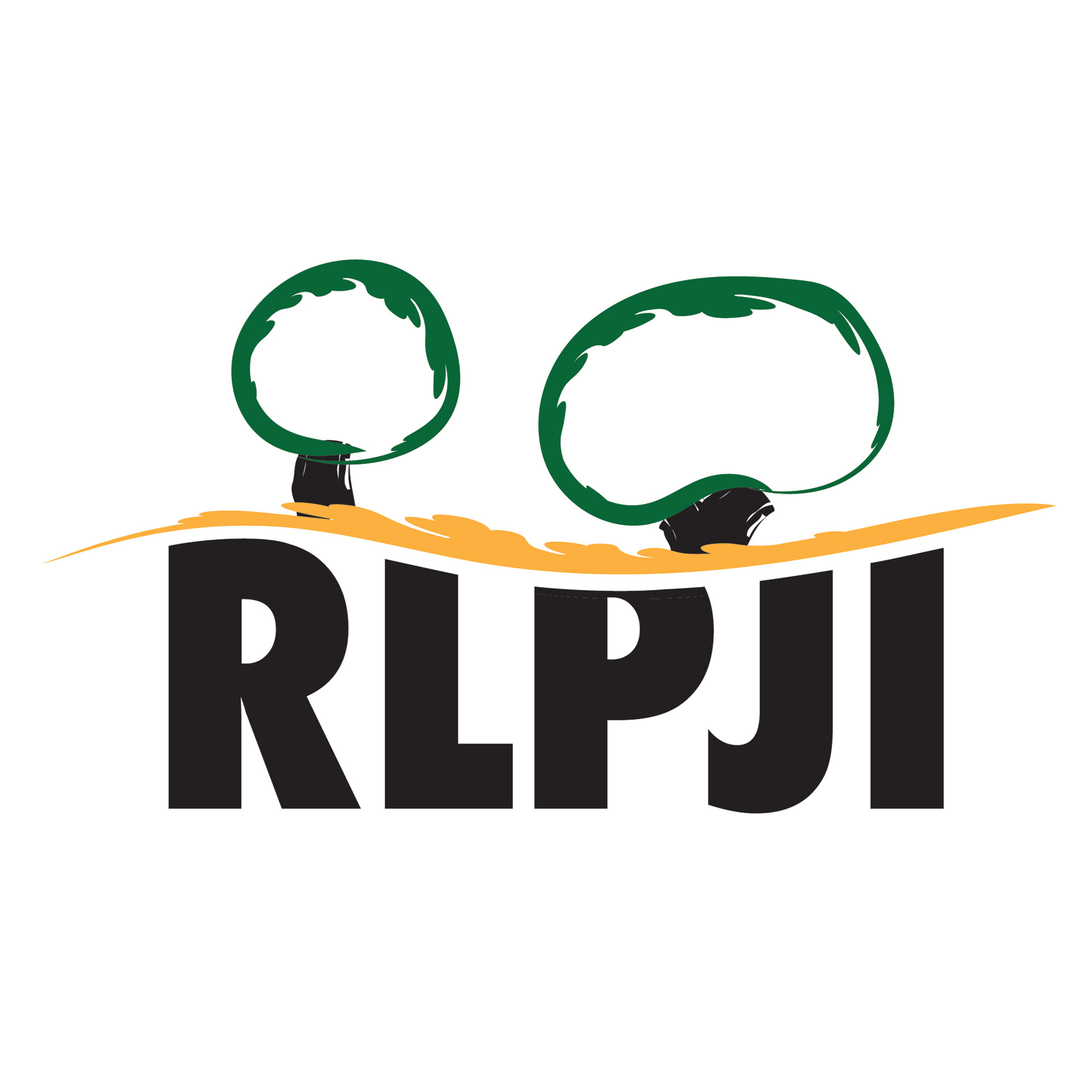
In July 2018, the EVC class spent two weeks working together as consultants for the Rice Lake Plains Joint Initiative (RLPJI, now Rice Lake Plains Partnership [RLPP]). During those two weeks, we worked on developing an effective communications strategy, content creation (mostly photo and video), website redesign, and rebranding. I participated in the photography and website development aspects of the project, but my main role was as co-leader of the design/branding team. The main deliverable that we focused on was designing a new, simpler, more scalable logo. Their existing logo was a pencil-sketch-style image of a savannah sparrow perched a stock of big bluestem grass, both native species of the black oak savannah/tall grass prairie that the RLPP strives to protect.
Since they didn't specifically request a new logo, and we were potentially going out on a limb with that recommendation, my first designs were essentially just simpler, more scalable versions of the existing image/sketch logo.

Blue karner butterfly design
Prescribed burn/black oak savannah design
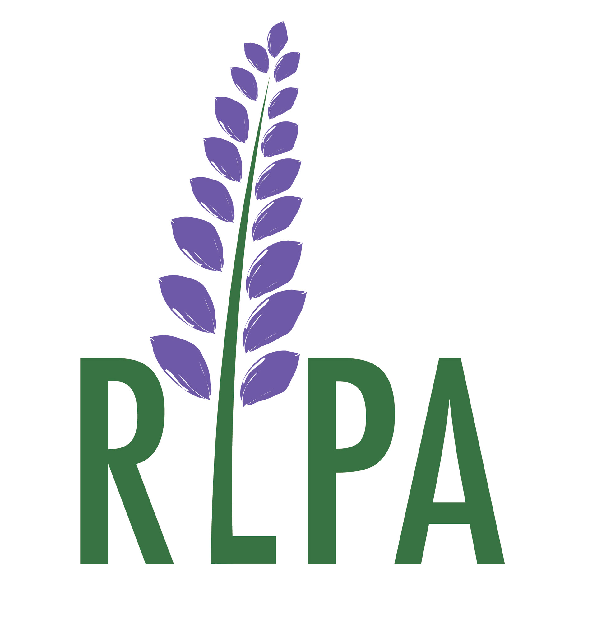
Purple lupine design
Savannah sparrow/blue stem/prescribed burn badge design
Over the next few days, I came up with as many alternative designs as I could, so that we had several options for the client to choose from. At the time, the existing name was the Rice Lake Plains Joint Initiative (RLPJI), but since part of our rebranding recommendation was to replace "Joint Initiative" with something simpler and easier to say, we tried out some of the logos with the alternative letters/words that we included in our communications plan. Each logo contains some aspect representative of or important to the Rice Lake Plains (usually a native species of plant or animal).
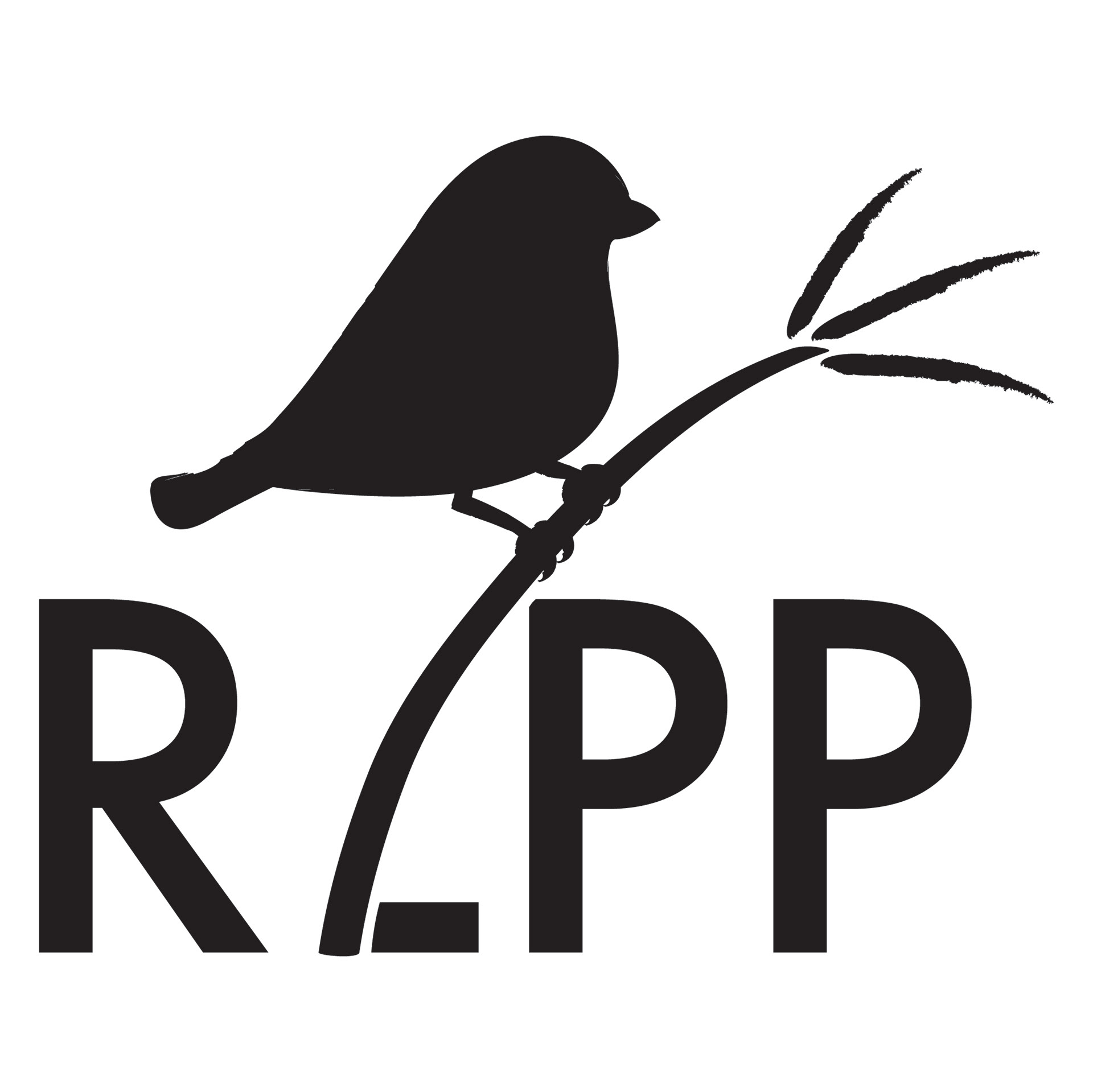
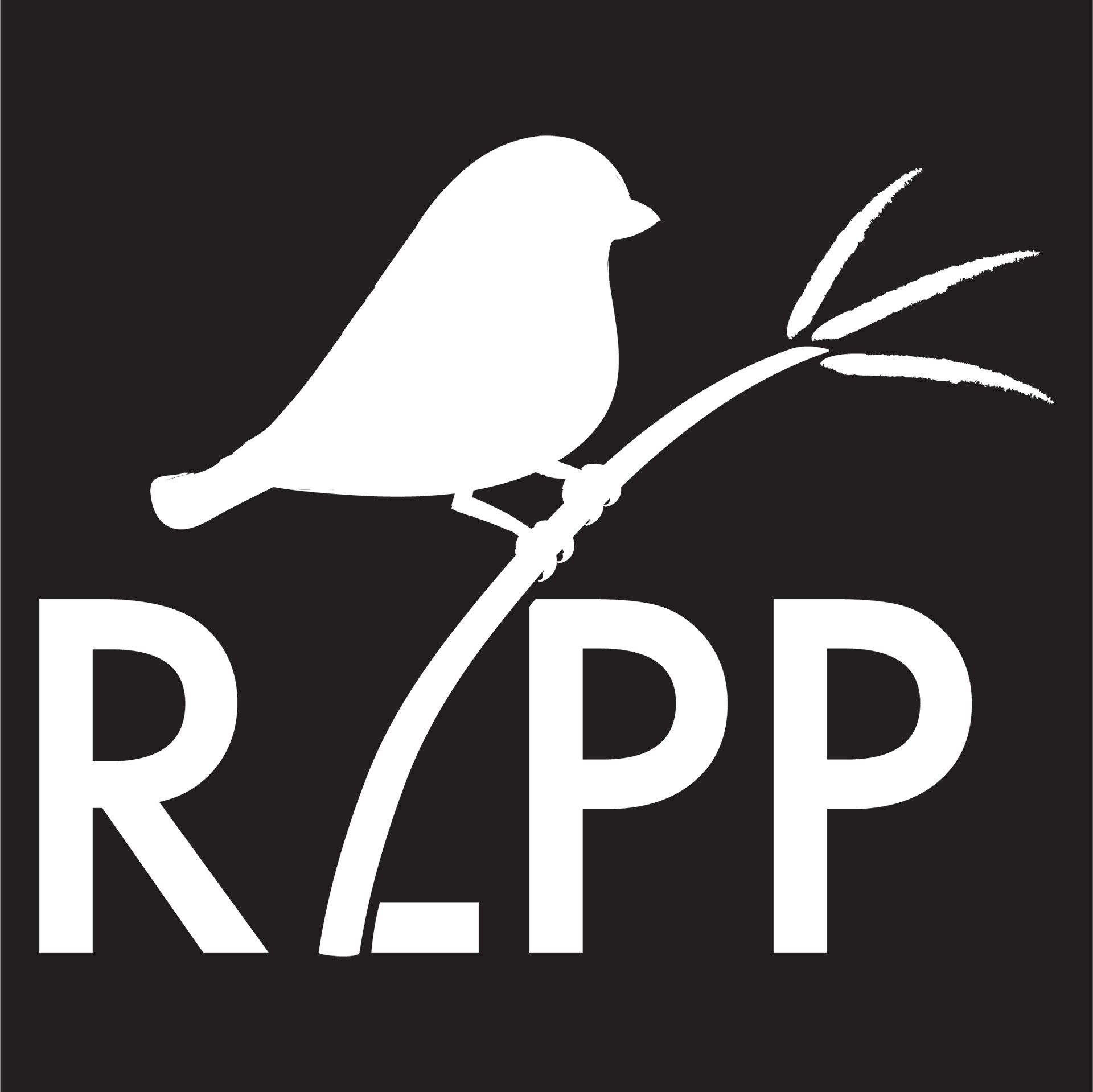
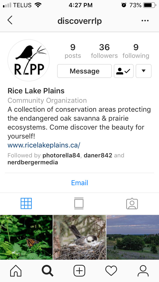
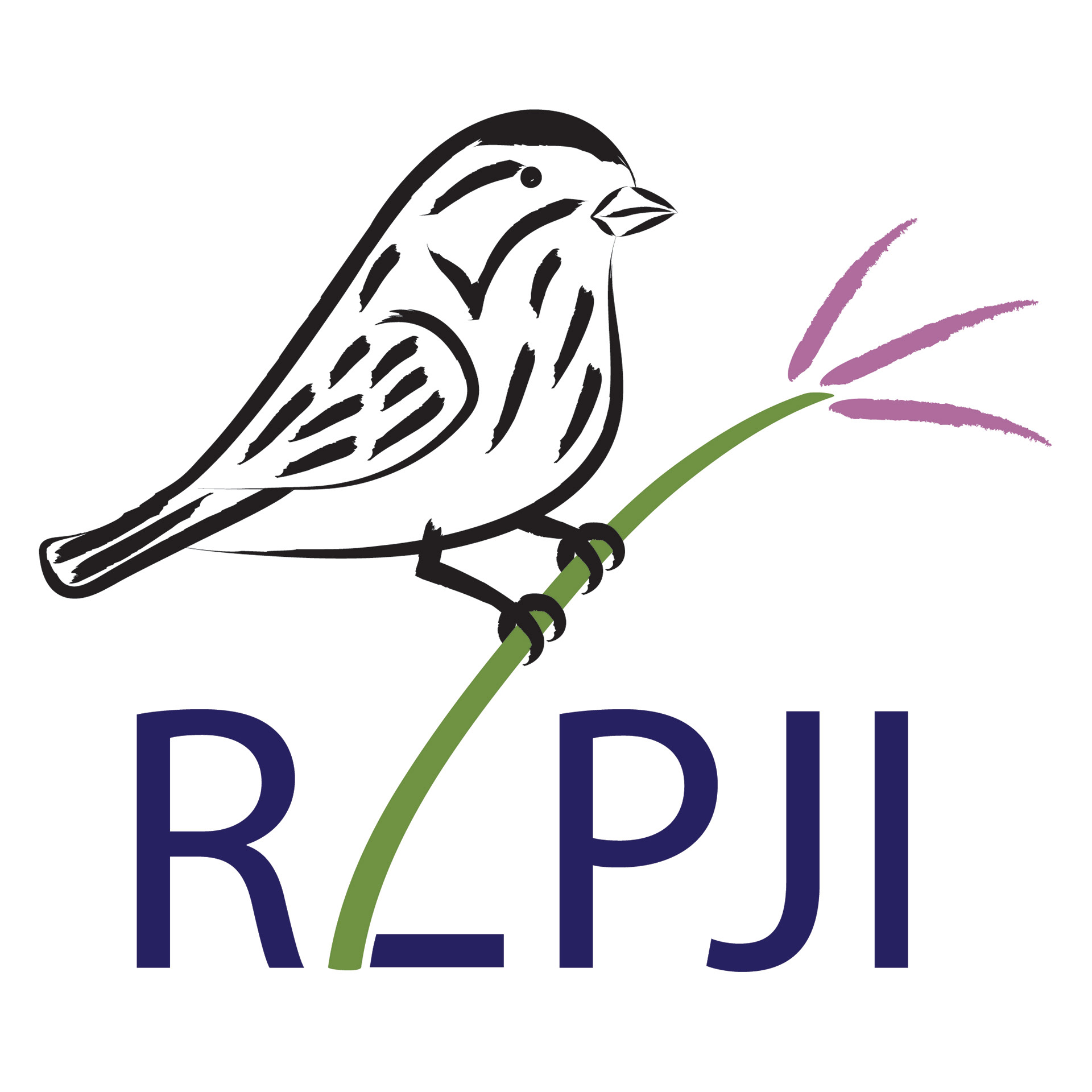
After getting feedback from the rest of the team, we decided that our strongest logo was the savannah sparrow on the big bluestem, but even simpler and converted into a silhouette. We used this logo (with "RLPJI" because we didn't know if they were going to go for the name change yet) for the communications guide that we sent to the organization (see below), and it also ended up being their choice for their new logo, and is now in place on their website and social media pages (see below).
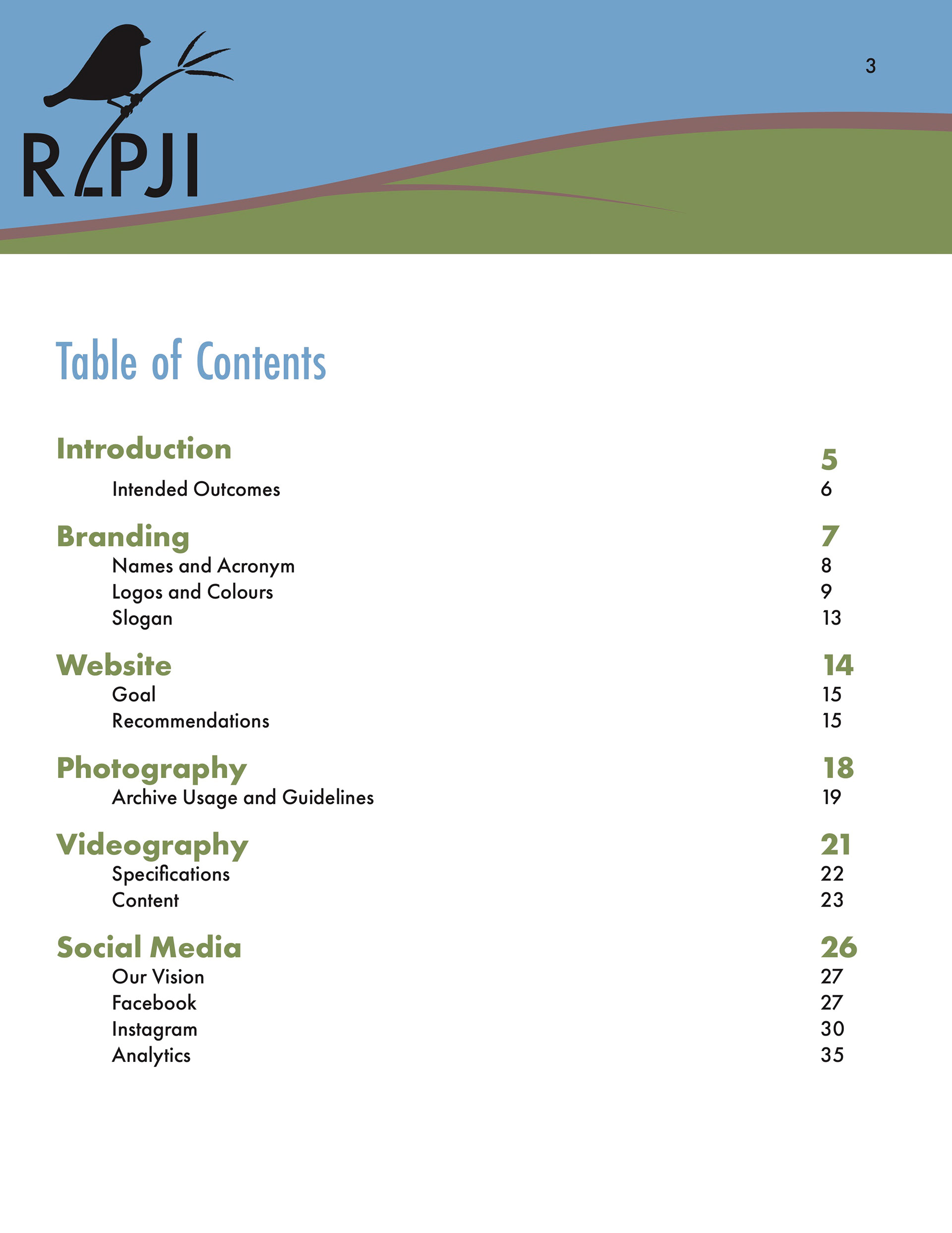
In addition to the logos (and associated colour schemes), I was also responsible for coming up with the overall look of the communications plan, the final deliverable that we handed over to our clients. I designed a banner which would go at the top of each page and developed a hierarchy for typography as demonstrated here, in the Table of Contents.
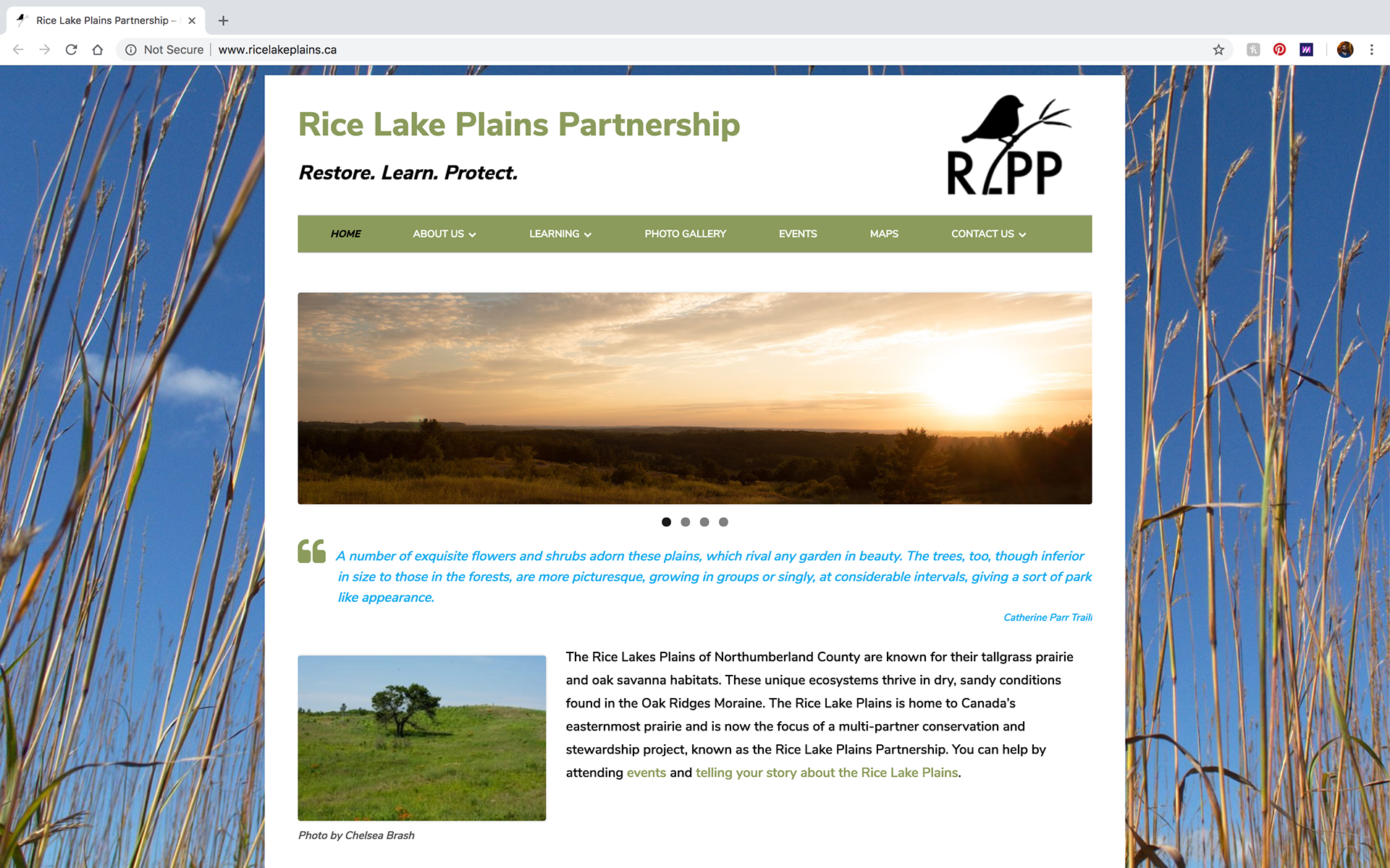
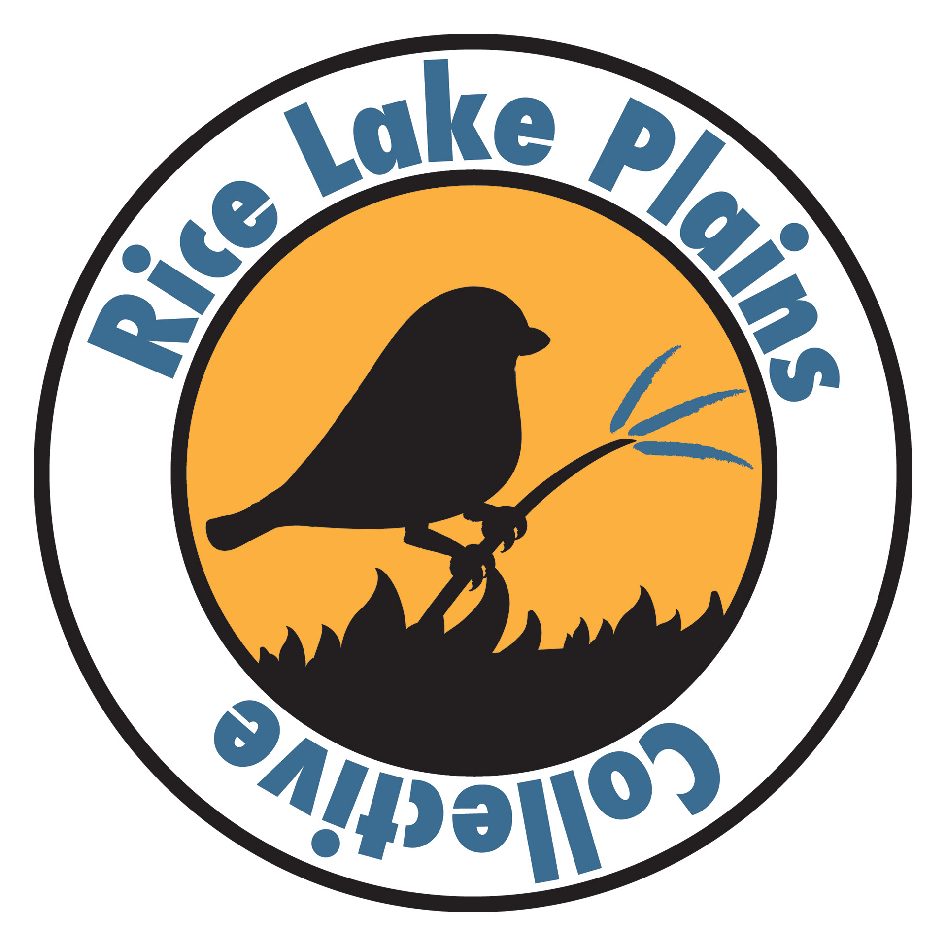
Rice Lake Plains Partnership website